The Background of an Aquascape
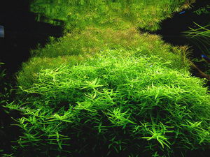
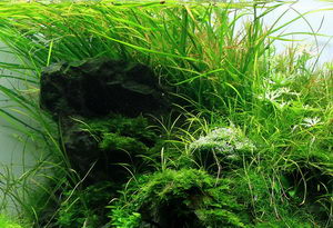
The background might well be considered the fitting conclusion of a layout design. Here you can use larger plants that blend into the overall picture, and the hardscape often projects into this area. Despite all the freedom you have in creating your layout design, keep some things in mind so your background won?t look overdecorated. The principle of free spaces can be applied to this zone very well in order to create more depth. A wall formed by stem plants constricts the layout too much. A gap in this densely planted background, however, creates depth. We often depict natural sceneries or sceneries from our terrestrial surroundings, and the symbolism of a wide horizon can be worked into the layout easily by a clever design of the background zone. A light-coloured backdrop or foil background is best for evoking this notion. White foil, for example, will make your tank look spatious. A black foil creates an enormous contrast to the colours of the plants, but makes the tank look smaller.


A well-planned layout does not need structured backdrops or photo backgrounds. There might be layouts where a structured backdrop can be integrated into, but it will always narrow down your creativity. Photo backgrounds are often harshly coloured, and their motifs usually do not fit into the layout design anyway. Unicoloured, neutral foil backgrounds will offer you more leeway for your layout and have a positive effect on the overall design.
