Basic Forms for an Aquascape
When planning a layout for a nature aquarium you basically have three elementary forms: the triangle, the hill, and the U-shape. Of course, these elements can be combined. Depending on the layout, the transitions between those forms are smooth, and even new structures may emerge.
The Triangle
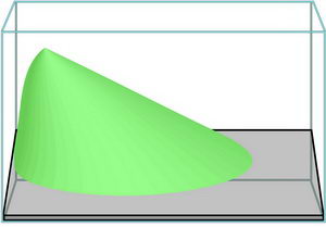
The triangle gives us a simple and well-structured form that leaves lots of leeway for the placement of the plants and the hardscape. For this style, it is all-important that the substrate rises towards the background to give the entire layout a sense of depth ? the substrate height in the foreground is low and increases towards the back. Make sure you consider the substrate structure from all sides that are visible for the onlooker. When planting you should also keep to this structure, placing smaller plants in the foreground and larger ones towards the back. A sloping structure is not only possible from front to back, but also from left to right or vice versa.
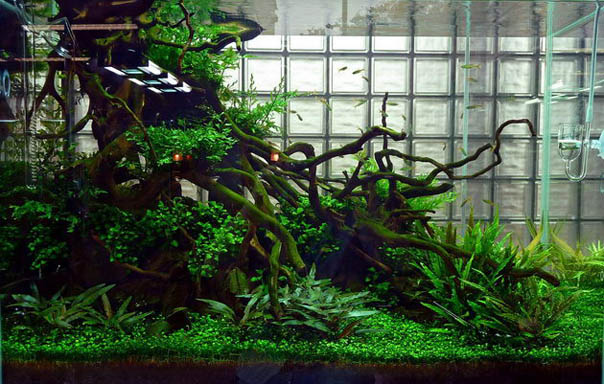
© 2010 Takashi Amano, ADA Galerie Japan
The U-Shape

The U-shape enables us to create an effective layout relatively easily. The plants and the hardscape are positioned on each side of the tank, and there is a free space in between, which gives the whole layout a sense of depth. The free space should not be placed directly in the middle of the tank, but follow the golden section (we will be explaining this ratio a little further down). In a nutshell, the ratio between the planted areas should be ??? or vice versa. Avoid symmetry at all cost.

© 2010 Takashi Amano, ADA Galerie Japan
The Hill
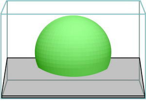
In this rather sophisticated layout variant, medium- to tall-growing plants and the hardscape like e.g. decorative driftwood and rocks are concentrated in an area in the middle of the tank. This centralisation brings the focus to the middle of the tank ? which requires careful layout and maintenance. The foreground and the sides are planted with very low-growing plants. Unplanted sandy areas or smaller rock arragements also lend themselves to this kind of decoration.
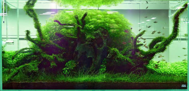
© 2010 Takashi Amano, ADA Galerie Japan
Creating Perspective

This layout form stresses the perspective character of the layout. Takashi Amano uses this technique in several of his recent layouts to give his aquascapes more depth. Two foreground areas on the left and the right side are planted with medium- to tall-growing stem plants. In the middle of the foreground we have an area with ground-covering waterplants that give us a free view at the middle and the background. In the middle ground as well as in the back, the steep slope of the substrate forms a hill planted with low-growing small plants. This invokes the illusion of a far-away hill framed by forest.
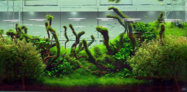
© 2010 Takashi Amano, ADA Galerie Japan